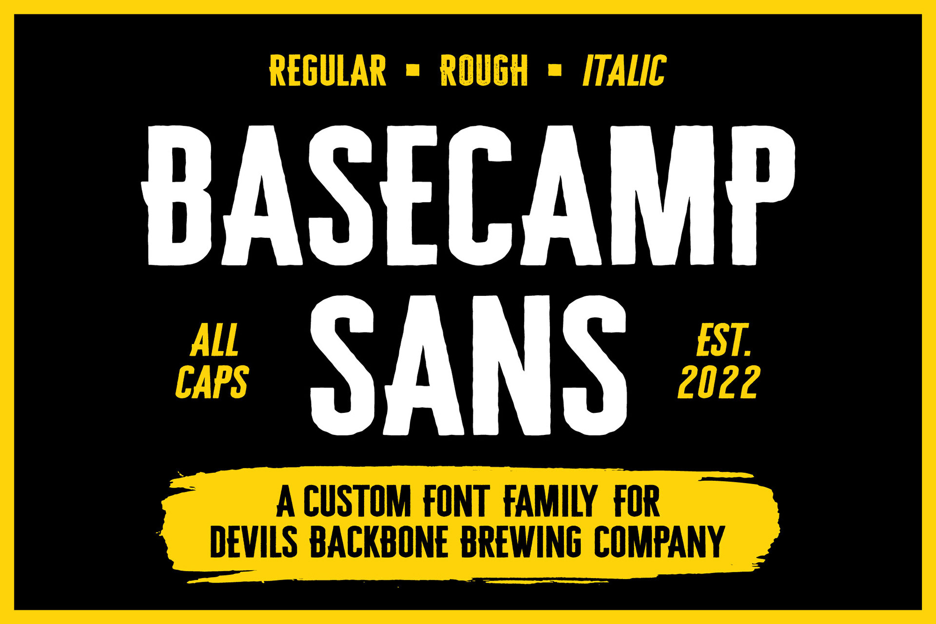
BASECAMP SANS
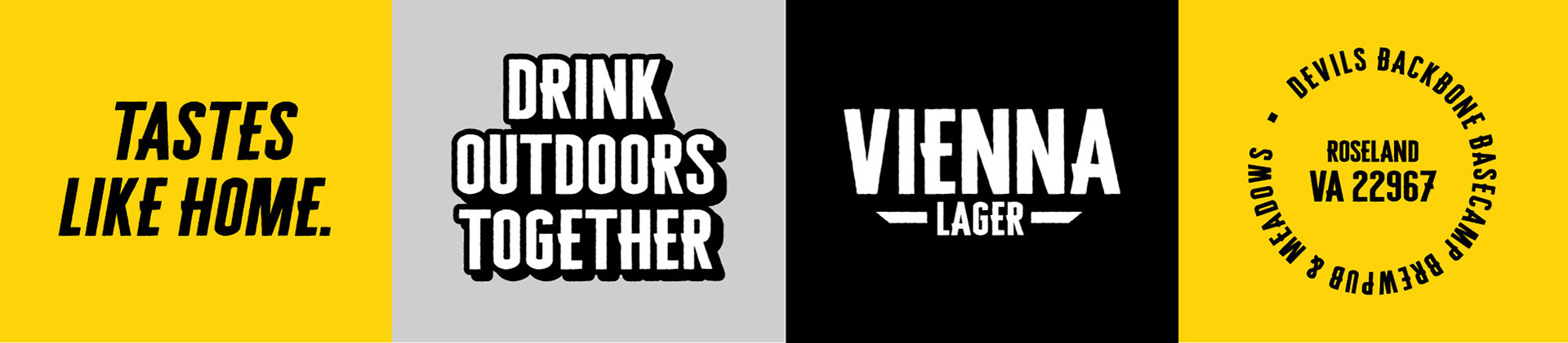
BRANDING, PACKAGING DESIGN, SUPPORTING MATERIALS
With Devil’s Backbone Brewing Company's brand refresh in 2022 came the need for a unique, ownable typeface that both reflected their core values and felt at home on their packaging.
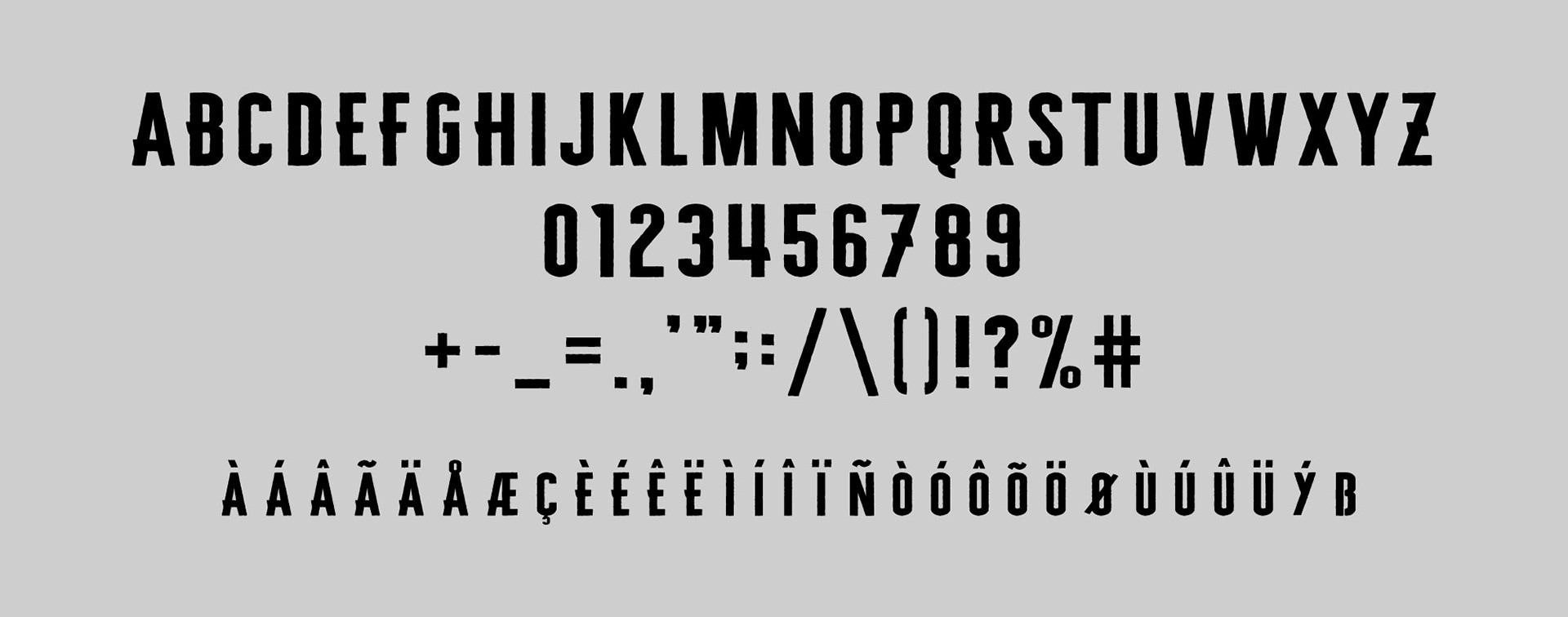
Basecamp Sans, named after Devils Backbone’s “Basecamp” location, was developed to have a rugged, outdoorsy quality that matches the Brewery’s home in the heart of the Blue Ridge Mountains. The letterforms are tall and condensed to maximize their size and impact on the narrow real estate of a can or a bottle.